CHAITANYA GADDAMWAR

Roles & Responsibilities:
Project Duration: 3 months
Visual Design Timeline: 3 Weeks
Team: 5 UX Designers
Tools: Figma, Miro, Trello, Maze, Adobe After Effects, Photoshop, and Illustrator
GreenQuest: Helping People Turn Eco-Intentions into Actions
1. Overview
GreenQuest is a mobile app designed to help people who care about the environment by taking real, everyday actions to live more sustainably. During the project, we learned that many people want to make eco-friendly choices but struggle to follow through. They feel overwhelmed, unsure of what really makes a difference, or simply don’t have time to think about it.
2. Core Problem
Many people care about climate change and genuinely want to make better choices in their daily lives. But when it comes to taking action, they often forget, get too busy, or feel unsure about what actually makes a difference.
Through our research and early interviews, we noticed a clear gap between what people intend to do and what they end up doing. This gap is not caused by a lack of motivation, but by uncertainty, everyday distractions, and the fact that progress often feels invisible.

We aimed to design an experience that helps people turn good intentions into small, doable actions. By making progress easier to see and decisions feel more rewarding, we wanted to support long-term habit building around sustainable living.
3. Problem Statement
Individuals' CO₂ emissions are a contributing factor to climate change. However, while people may be aware that they're making a difference, they are not able to visualise their environmental impact, making it harder for them to stay motivated. Gamifying tasks to reduce one's CO₂ levels and displaying these results, as well as assigning points to actions in a leaderboard will encourage continuous participation in reducing one's carbon footprint.
4. Initial research findings
We began with secondary research to understand the broader climate problem and identify opportunities for meaningful design. This included reviewing climate reports, academic papers, and user behaviour studies related to sustainability.
i) Climate Context (Ireland and Global)

Ireland is currently behind on its climate target of reducing carbon emissions by 51% by 2030 (Social Justice Ireland, 2024). Like many countries, it faces challenges in changing public behaviour and encouraging long-term habits that reduce carbon footprints.
Globally, carbon emissions from everyday actions like transport, food, and consumption are major contributors to climate change. These actions are often invisible to users and hard to measure, which makes change difficult.
ii) Target Audience: Gen Z and Millennials
We focused on Gen Z and younger millennials who care about sustainability but struggle with consistency. Based on recent studies:
-
56% of Gen Z believe businesses should take responsibility for environmental issues (Shaw, 2024).
-
72% think companies should be held accountable for their impact.
-
69% of Gen Z and 73% of millennials are actively trying to reduce their environmental footprint (Marks, 2023).
However, many prefer small personal changes rather than joining environmental groups or formal volunteering (Chun et al., 2023). They are more likely to avoid plastic, walk instead of drive, or try second-hand shopping. These users feel more motivated when they see others doing the same. Social influence is a key factor in their decision-making.
iii) Behavioural Science and Design Insights
From socio-ecological research, we learned that people are more likely to build eco-friendly habits when they receive visible feedback. This is called eco-feedback, and it works by helping users see the results of their small actions.
Apps that display progress, such as carbon saved or trees protected, help users stay engaged. Gamification features like points, levels, and badges make tasks feel more playful and less like a burden.
However, we also learned about the rebound effect, where users feel they have done enough after one good action and then become less careful with their choices (Bremer et al., 2023). So we knew the design had to gently encourage consistency without making users feel judged or guilty.
iv) Additional Key Insights from Educational Resources


Alongside climate reports and research papers, we explored simplified educational resources to better understand the science behind climate change. Some important takeaways were:
-
Greenhouse gases like carbon dioxide and methane have risen sharply since 1990, showing the urgency of the climate crisis.
-
The carbon cycle has been disrupted by human activities like burning fossil fuels, which trap heat in the atmosphere.
-
The Earth now retains more heat from the sun, leading to global warming and more frequent extreme weather events.
-
Among energy sources, coal and gas have the highest emissions, while wind and nuclear power have the lowest. This pointed to the importance of promoting clean energy choices.
-
Data on emissions by sector revealed that transportation and electricity are the top contributors. This helped us narrow our app focus to daily actions related to commuting, energy, and food use.
These insights supported our decision to design for users who want to reduce their impact but need help turning good intentions into real progress. Our design challenge was to make eco-friendly habits feel clear, rewarding, and easy to repeat.
5. The Impact of Data
The secondary research helped us understand what users care about and where they struggle. We saw that Gen Z leads the conversation around climate action. They are vocal online, but prefer simple, personal actions over joining environmental groups. They also care about what their peers are doing. This showed us the importance of social motivation and relatable, individual steps.
We also learned from the literature that people respond well to eco-feedback systems. These systems show small wins like “trees saved” or “carbon avoided,” which can build awareness and motivation. Tools that include these kinds of visuals help users make sense of their actions.
Gamification came up as another useful strategy. Studies suggest that rewards, streaks, and challenges help people stay motivated. At the same time, we saw a risk. Some users may do one eco-friendly thing, then feel they’ve “done enough” and stop there. This is known as the rebound effect.
Based on these findings, we decided that our design needed to do the following:
-
Offer small, clear goals that feel achievable.
-
Show visual progress in a fun and simple way.
-
Use a supportive and non-judgmental tone.
-
Avoid pressure or guilt.
This helped us shape GreenQuest as a tool that guides, encourages, and celebrates effort, instead of pushing perfection.
6. Interview and Survey Findings :
We began by circulating user-survey to understand general behaviours, motivations, and barriers around sustainable living. As the responses started coming in, we also began conducting one-on-one interviews to explore some of these themes in more depth.
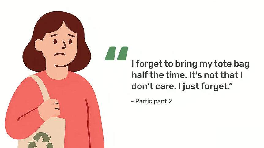
We spoke to 25 people through a survey and conducted in-depth interviews with 3 participants. Most were students or postgraduates living in Dublin who wanted to live more sustainably but struggled with consistency.
The participants said they care about the environment and already take small steps like recycling, reducing waste, and avoiding fast fashion. But they also shared some common challenges. Their words helped us in deeply understanding how climate concerns show up in everyday life. Here’s what stood out:


The survey results also showed that most people cared about climate issues, but their actions weren’t consistent. Many didn’t use any tools to track their efforts and found it hard to stay motivated. What they wanted was something easy to follow, built into their routine, and meaningful enough to keep going.
The following quantitative insights helped us validate our early assumptions and identify common behaviours amongst our target audience.

Based on a combination of survey responses and interview conversations, we looked for recurring patterns in how people thought, felt, and acted and several clear themes began to emerge.
-
Most people had good intentions but felt stuck
Many wanted to reduce their carbon footprint but didn’t know where to start or what actions made the most impact. -
Tracking tools felt too technical or disconnected
Participants said existing apps were either too detailed, confusing, or not designed to motivate them emotionally. -
People were influenced by what others were doing
Seeing friends recycle, take public transport, or post eco-friendly actions on social media made them want to do the same. -
Habits felt hard to maintain without reminders
Most people said they forgot to act sustainably unless nudged. Even the smallest tasks needed a prompt or reward. -
Emotional connection made a difference
When we shared examples of visual progress (like a plant growing or a streak calendar), participants responded positively and said they’d feel more motivated to stay on track.
They want help, not guilt
The insights from both the surveys and interviews pointed to a common theme: people wanted support, not guilt. They didn’t want to feel judged. Instead, they wanted something that could gently remind them, celebrate small wins, and keep them motivated over time.
This helped us shape the app as a friendly companion that encourages sustainable habits in a positive, confidence-building way. Rather than pushing or pressuring users, the goal was to make them feel supported, seen, and empowered.
7. Personas
We created two main personas that helped shape our design direction. These personas capture the differences in knowledge, motivation, and emotional needs between two user types who both care about the environment but experience it differently.

The first persona is a young professional who already takes eco-friendly actions. He has a good understanding of climate issues and wants to deepen his habits. He enjoys structure, values measurable progress, and feels motivated by tools that let him track what he’s doing. But even though he’s tech-savvy and well-informed, he still struggles with time, information overload, and the feeling that his efforts don’t always matter.

The second persona is a university student balancing work, studies, and life pressures. She wants to live more sustainably but often feels unsure where to start. Her actions are driven by emotion and hope, not metrics. She feels inspired by her friends and wants to believe her small actions matter. But like many in her age group, she gets overwhelmed by the amount of information and finds it hard to stay consistent without visible feedback or encouragement.
Both personas helped us design GreenQuest to support people at different stages of their climate journey; from those just starting out to those who want to go further but need help staying motivated.
8. Brainstorming and Solution
After completing our user research, we began generating design ideas based on the real motivations and challenges of our users. We used “How Might We” (HMW) questions to reframe insights into opportunities, and ran structured ideation sessions using the Crazy 8s technique. Each team member rapidly sketched eight ideas in eight minutes. This helped us avoid early judgment and think beyond the obvious.
1. How might we make eco-friendly habits feel easier to start and stick with?
Many users said they want to live sustainably but struggle to begin or stay consistent. We looked for ideas that offered small wins, encouragement, and structure.
Crazy 8 ideas included:
-
Carbon footprint calculator with numerical feedback
-
Micro-pledges users can commit to for a few days or a week
-
A checklist of low-effort actions like “skip plastic” or “walk instead of drive”
-
A “spin the wheel” feature that suggests one eco-action per day
-
A dashboard that visualizes routine completion with streaks and animations
-
A swipe interface to accept or skip quick tasks
-
A “climate calculator” showing impact in relatable terms (e.g., saved CO₂ balloons)
2. How might we help users see the impact of their small actions clearly?
Users said they often can’t tell if their actions matter. We explored ways to make progress feel visible, meaningful, and motivating.
Crazy 8 ideas included:
-
A growing virtual tree avatar that reflects user progress
-
Visual comparisons like “you saved 3 plastic bottles” or “X kg CO₂”
-
A timeline animation showing positive weekly change
-
Badges for reaching environmental milestones
-
A tracker that converts impact into everyday objects like trees or bottles
-
A “Green Meter” that fills up with positive actions
-
Before-and-after illustrations showing cleaner environments
-
A community heatmap showing collective impact
-
A donation option that appears after certain milestones
The tree avatar, visual carbon equivalents, and daily confirmation messages were integrated into the final design. The donation feature was explored but rejected.
3. How might we make sustainability feel fun instead of stressful?
Some users said they feel guilt, pressure, or fatigue when engaging with climate topics. We brainstormed ideas that could lighten the mood and reward small steps.
Crazy 8 ideas included:
-
Eco-streaks and badges that build over time
-
Unlockable achievements for completing task series
-
Quizzes with short, fun climate facts
-
Celebratory animations after task completion
-
A “mood meter” that reflects emotional climate progress
-
Eco-themed games or mini-challenges
-
Funny or relatable eco-memes to reward participation
-
A plant that grows when a task is done
-
A leaderboard that compares users based on eco-points
-
A public feed to share memes or eco-updates
Gamified streaks, quizzes, badges, and the visual avatar were selected and prototyped. Public comparisons like leaderboards and meme feeds were later dropped.
4. How might we support people who feel alone or unsure in their climate efforts?
Our research showed users felt more motivated when they saw peers taking action. We ideated ways to support social encouragement without public pressure.
Crazy 8 ideas included:
-
Group challenges among friends or close circles
-
A shared tree that grows faster when all group members contribute
-
A buddy system that pairs people with similar eco-goals
-
Progress rings showing how much each member helped this week
-
Team quests where users must each complete a part
-
Eco-reminders that friends can send to each other
-
Shared badges earned through group milestones
-
A small-group leaderboard (private only)
-
Mass public challenges like city-wide quests
The app includes small-group features like friend challenges and team goals. Larger public quests were considered but rejected based on user discomfort.
We used these Crazy 8 sessions to capture a wide range of directions. Nothing was ruled out at this stage. Later, we clustered similar ideas and began testing which ones could best support user needs. That evaluation began in the next phase of wireframing.
9. Lo-Fi Wireframes
To begin visualising key features and interactions for the app, we created a set of low-fidelity wireframes on paper and digitally using Miro. These wireframes helped us explore different layout ideas, user flows, and navigation structures before moving on to Hi-Fidelity designs. At this stage, our focus was on usability and functionality rather than visual style. We paid close attention to how users might set goals, track their carbon impact, and engage with gamified eco-tasks.
While the usual design process suggests creating user flows and app structure before making wireframes, we didn’t strictly follow that order. Instead, we started sketching low-fidelity wireframes early on. As we drew the screens, we found it much easier to imagine how users would move through the app. That’s when we naturally started building out the user flows and figuring out the overall structure.
This way of working felt more practical for us. It helped us connect the design ideas with how the app would actually work. Even though our process was not exactly step-by-step, it helped us think better. It let us test ideas quickly and change directions when needed. It also helped a lot during our group discussions. We had 3 to 4 rounds of internal feedback sessions, and having wireframes made it easier for everyone to share ideas and decide which direction made the most sense for the app.


10. Critical Design Decisions
As we explored different design ideas through low-fidelity wireframes, we had to make some important decisions about what to include in the app and what to leave out. These choices were not always easy. They came from a mix of research insights, team discussions, and trial-and-error while sketching.
We didn’t follow a strict process, but we kept asking ourselves:
What actually makes this app more useful or motivating for someone who wants to live sustainably?
Some ideas stood out quickly because they felt simple, meaningful, or easy to build on. Others looked good on paper but didn’t match what users needed or felt too complex at this stage. Below are the concepts we explored, and the reasons we selected or rejected each one.
1. Leaderboard and Ranking Screen ✅ (Refined)

We started with a podium-style layout that visually highlighted the top three users and showed others ranked below by total CO₂ saved. This concept helped promote a sense of healthy competition and social motivation. While the idea had potential, we made several changes to improve clarity, usability, and consistency across the app.
Why it was refined?
-
Podium replaced with medals for better use of space
The podium design was easy to understand but took up too much space on smaller screens. It pushed the remaining ranked users far down the list. So we replaced it with medal icons for the top three users, gold, silver, and bronze, placed beside their names. This kept the meaning clear while making the layout easier to read.
-
Added Ranking filters and ‘Show My Rank’ button
To make rankings more useful, we added tabs to switch between weekly, monthly, and all-time scores. We also included a “Show My Rank” button so users could quickly find their own place in the list. These small changes made the leaderboard feel more interactive and personal.
-
Visual style aligned with the rest of the app
In the updated version, we focused on displaying Green Points and levels instead of just numbers. Each user’s row showed their name, total Green Points, and a level badge that matched the style used across the app. The layout used soft colors and clean alignment, making the screen feel lighter and more welcoming. These changes helped users see a clear connection between their daily eco-tasks and their rank, which made the leaderboard feel more rewarding and purposeful.
2. Globe with Fog as Home Screen Progress Tracker ❌ (Rejected)

This concept used a fog-covered Earth that cleared up as users gained green points. It aimed to show that personal actions can lead to a “clearer planet,” while also displaying total CO₂ saved in kilograms.
Why it was rejected?
-
It felt too serious and abstract
While the Earth metaphor was meaningful, the fog made the screen look dull and heavy. It didn’t spark any emotional connection. Users might know what fog means in theory, but it didn’t feel playful or uplifting in the way we wanted the app’s tone to be.
-
It lacked a sense of reward
Even though the screen showed CO₂ saved, the feedback didn’t feel personal or exciting. There was no clear moment of celebration. The Earth simply stayed there. The plant growth idea, in comparison, made each step feel more rewarding and alive.
-
It confused the idea of progress
The fog slowly disappearing wasn’t as easy to notice as a plant growing taller or blooming. Also, the fog being present all the time made it look like the user hadn’t done enough, even if they had already started making progress. That felt discouraging instead of motivating.
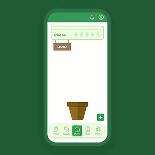
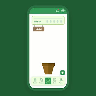
3. Growing Plant on Home Screen ✅ (Accepted)
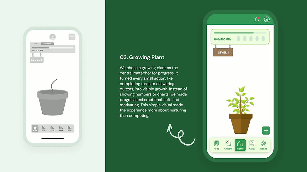
The plant-growth idea for the home screen felt instantly relatable. It gave a visual meaning to progress and made the experience feel less like tracking numbers and more like nurturing something. This direction was chosen because it made people feel good about small actions and created a sense of growth tied to real-world impact.
-
The visual metaphor was simple and meaningful
The growing plant gave users something they could emotionally connect with. It helped people understand progress in a visual way. As green points were earned, the plant grew. This made abstract actions like answering quizzes or completing daily tasks feel more tangible and rewarding.
-
It encouraged participation without pressure
By showing growth instead of stats, users were gently nudged to keep going without feeling overwhelmed. The points and levels added a layer of gamification, but it stayed soft and motivational. The animation and micro-interactions made it feel alive, without being distracting.
-
It kept the experience clear and consistent
The layout was clean, with all attention on the plant and eco progress bar. The navigation was consistent across screens, helping users feel grounded. Every element supported the main message: your small actions matter, and here’s how they grow over time.
4. Community Quests via Map ❌ (Rejected)

The idea of showing local environmental issues on a map and encouraging users to take action through community quests sounded engaging at first. It aimed to connect users with real-world problems and promote location-based challenges like walking in high-traffic areas or helping clean polluted spots. But after several rounds of group discussion, we decided not to move forward with this feature.
Why it was rejected?
-
It added too much complexity for version one
The map feature needed location tracking, real-time data, and a way to confirm if users actually completed the tasks. For our first version, it felt too heavy to build and test. It also took focus away from what mattered most, that is helping users build everyday sustainable habits.
-
It created pressure instead of motivation
During our feedback sessions, many felt this idea might overwhelm users. Challenges like walking for two months or fixing large problems felt too big and hard to stick to. People liked the idea in theory, but said they would probably ignore it if it showed up in the app.
-
It was hard to personalise
Not everyone lives near places marked on the map. Someone in a rural area might not see any quests at all. This made the experience feel uneven and unfair. We didn’t want users to feel like the app had nothing for them just because of where they lived.
5. Daily Tasks Section ✅ (Accepted after Simplification)

We began with a detailed version of the Daily Tasks screen. It had a long list of items, point values, filter options, and even sorting by favorites. But when we tested it as a team, it felt overwhelming and too text-heavy. We were also unsure about how to assign points fairly to each task. Some actions felt bigger than others, but trying to weigh them led to more confusion.
After discussing with our mentor, we decided to keep it simple. In the Hi-Fi design, we gave each task a flat value of green points. This made the system feel clearer and more equal for users, and it also made tracking progress easier.
Why it was simplified?
-
The original screen looked too crowded
Too many visual elements were placed close together. Filters, checkboxes, stars, and categories made it harder to focus. It felt more like a spreadsheet than a task screen.
-
The simplified version felt quicker to use
In the Hi-Fi design, we grouped tasks into categories with icons. Each task had a short line of text and a clean layout. It made the screen feel calm and easier to scan.
-
We aimed to add sense and meaning, not just green points
We added short task descriptions that explained the impact. Users could also turn tasks into challenges. This made each action feel more personal and encouraging, without adding confusion.
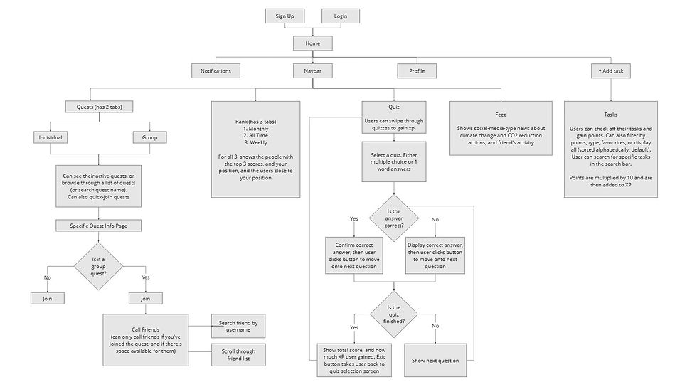
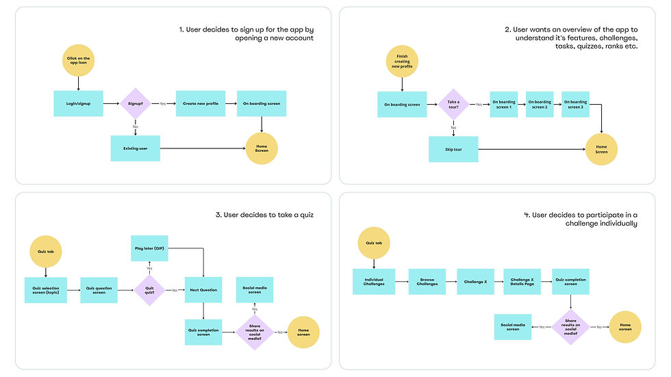
11. App Architecture, User Flows & Design System
After finalizing the low-fi wireframes and discussing critical design changes, we moved on to building our high-fidelity wireframes. Before jumping into screens, we created a mini app architecture that mapped out the main user flows like login, tasks, quizzes, quests, and leaderboard. This helped us see how each screen connected with others and guided our layout decisions.
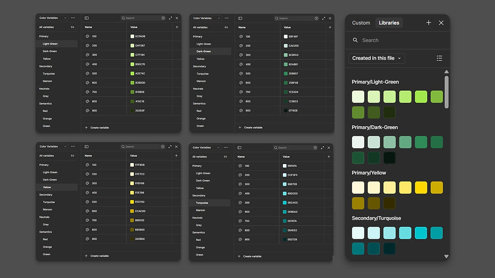
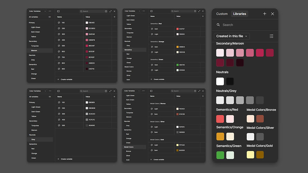
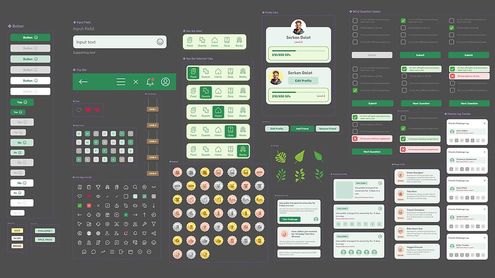
Alongside this, I developed a design system that brought visual consistency to the app. I defined brand colors, typography, icon styles, semantic states, button styles, and reusable components to ensure that every screen felt part of the same experience. These design tokens made sure every screen followed the same structure, tone, and interaction pattern.
We aimed for a design that felt clean, supportive, and motivating, without feeling too serious or complicated. Every element from layout to microcopy, was chosen to make the experience friendly and intuitive.
Key Highlights:
-
Calm and friendly visual tone
Used soft greens, neutral backgrounds, and rounded shapes to create a design that feels approachable and warm.
-
Clean layout and easy navigation
Clear spacing, readable text, and familiar icons helped users scan and navigate without effort.
-
Motivational without making feel pressured
Progress indicators like the growing plant and leaderboard encouraged regular use without making the app feel competitive.
-
Thoughtful micro-interactions
Tap feedback, transitions, and progress animations were kept subtle and consistent, adding polish without distraction.
-
Component-based consistency
Every screen followed a shared design system, which helped us maintain a uniform visual language while allowing room to adapt as needed.
-
Supportive tone of voice
The microcopy was intentionally written in a warm, encouraging way. We avoided technical or formal terms and focused on simple, user-friendly and helpful language.
12. Hi-Fi Wireframes
At this stage, I translated all the research insights, low-fi sketches, user feedback, and design principles into high-fidelity wireframes. My goal was to create a clean and consistent interface that felt friendly, encouraging, and easy to use. Every screen followed the visual system I had built earlier, including layout, typography, color, and component guidelines. I wanted the experience to feel simple but meaningful, and to visually reflect the idea of steady progress through small actions.


13. Animations and Microinteractions
To make the experience feel more alive and emotionally engaging, I added subtle animations and microinteractions across the app. These small touches helped communicate progress, gently guide the user, and bring a sense of delight to everyday actions.
Rather than using motion just for the sake of aesthetics, I made sure each animation served a purpose. The idea was to create a calm, supportive environment where users felt rewarded for their actions without feeling overwhelmed.


These microinteractions helped shape how the app felt, not just how it looked. They added warmth and made the experience feel more personal, especially for users who might feel unsure or anxious about where to start with sustainable habits.
14. Hi-Fi Prototype
After finalising the high-fidelity screens and components, I created an interactive prototype to test how the app would feel in real use. This helped me simulate the key user flows and experience the design as a working product instead of static screens.
We used this prototype to gather feedback during user testing. It also helped us find and fix minor usability issues before moving forward with the final version.
15. User Testing
To validate our design decisions, we conducted a usability test with 6 participants using a clickable prototype. Some of these users had also taken part in our earlier research. We observed how they moved through key flows, noted moments of hesitation, and gathered open feedback through think-aloud sessions.

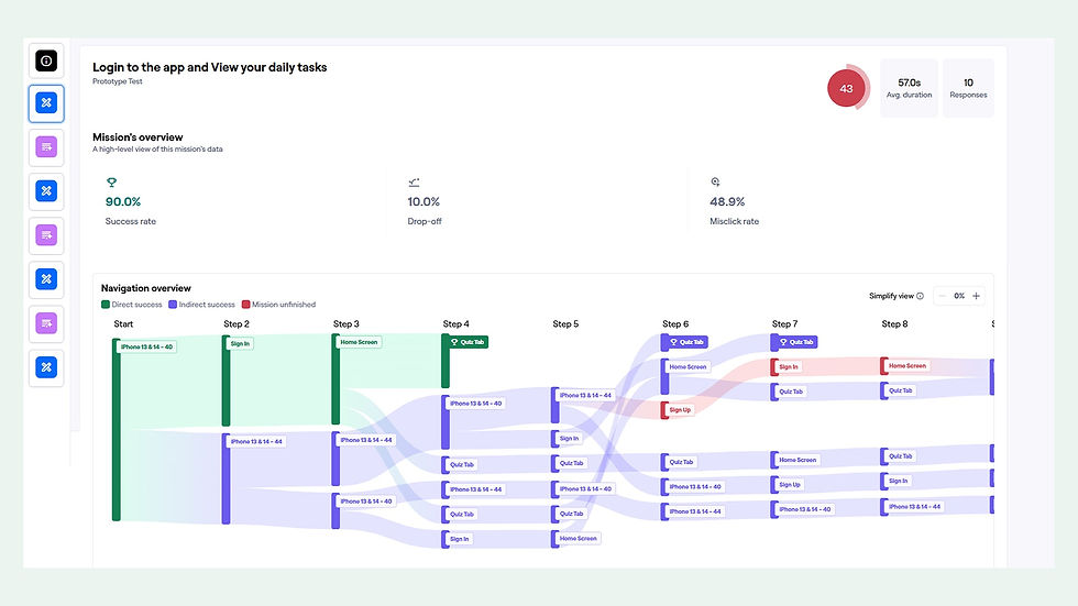

As the prototype was built in Figma, it didn’t offer the same constraints as a real product. At times, participants tapped around the screen to check which elements were interactive, which slightly influenced how they explored the app. We took this into account during our analysis and focused on whether users could complete the tasks, understand the feedback, and feel supported by the design.
Our aim was to see if the app felt intuitive, encouraging, and easy to use across its main features.
Key Highlights:
-
Login and Daily Tasks Flow
Most users were able to complete this flow successfully. A few took alternative routes before arriving at the task screen, which shows the design allows for flexible paths. Once discovered, users remembered the task flow clearly in later stages.
-
Navigating to the Current Quest
All participants reached the current quest screen, though some wandered briefly before finding it. This minor hesitation was expected, as the design intentionally encourages some exploration. Feedback suggested that once users located the quest, the interaction felt easy and repeatable.
-
Viewing Impact and Summary
This task saw the most variation. Some users struggled to find the impact section right away. Those who found it intuitively said it felt well placed, while others discovered it only after scanning through multiple tabs. This indicated a need to improve visibility without compromising on simplicity.
-
Joining a Friend's Quest
This flow worked well overall. Most participants understood the concept and joined the quest successfully. A few misclicks were observed due to overlapping CTA placements, which we will address in the next version.
Additional Comments from Participants:
-
“It was very educational. I’d use it more if I could.”
-
“Some parts were confusing at first, but they made sense once I got there.”
-
“I liked how the app encouraged me to keep going.”
-
“The navigation bar helped me explore when I got lost.”
16. Key Takeways
This project reminded us that designing for good habits is as much about emotion as it is about function. People don’t need to be told what to do. They need tools that fit into their lives, respect their time, and make them feel good about trying.