CHAITANYA GADDAMWAR


Refining a Patient App by Establishing Clear Visual Hierarchy and Lower Cognitive Load
I worked on a patient app, one of the six core modules of Azodha's 360-degree healthcare platform. The app helps patients build healthy daily routines and book online and offline coaching sessions. Patients also log their health details regularly so care providers can monitor progress and step in when needed.
Alongside improving key user flows, I also extended the existing design system and built new components where the product needed them. By the time the product went through its first release, I was collecting usability feedback and proposing design improvements. The primary goal was to reduce cognitive load and make it easier for patients to stay consistent with their health routines.
01. Identifying the Core Problems
The problems addressed in this work emerged through user testing and regular discussions with one of our client’s design team. I actively reviewed design comments shared on Figma, discussed edge cases and user concerns during weekly syncs, and clarified my doubts through ongoing conversations with the client-side designers, and with our internal team through daily stand-up calls.
I marked all the flows and screens where users slowed down or got stuck. These patterns helped me to shape design changes that focused on clearer visual hierarchy and fewer decisions for the user.
User flow 01. Adding/Editing Health Checkup Values (Medical History Log)

-
Initially users felt like the 3 options in the more section as blogs or articles (screen 1).
-
User testing highlighted that the records section felt dense and difficult to read on a small mobile screen (screen 4).
-
The table layout caused text truncation and required horizontal scrolling, which reduced scannability.
-
Users needed extra effort to edit values across entries, especially older users as the edit icon got hidden due to the horizontal scroll.
-
Over time, this layout made regular review of records feel tiring and harder to maintain.
User flow 02. SMART Habit Setup and Pledge Flow

-
Feedback from user testing and the client’s design team showed that the SMART habit setup flow felt heavy on mobile.
-
Long explanatory text increased reading effort and slowed users down at each step.
-
The flow introduced several decisions early, which increased mental load for users trying to build a new habit.
-
Progress across steps did not feel clear, so users perceived the setup as longer than it actually was.
-
The flow did not clearly reassure users that they could choose to close and continue later, which added pressure during commitment.
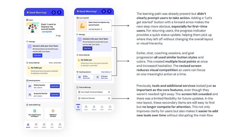
User flow 03. Home Screen view for the First-time & Subsequent Users

-
Primary and secondary actions appeared with similar visual importance, which increased scanning effort and hesitation.
-
Users needed extra time to understand what to do next instead of feeling gently guided forward.
-
User testing and discussions with the client’s design team showed that the self-guided section lacked a clear sense of direction, especially for first-time users.
02. Constraints
-
Every change had to feel native to the product rather than introduced from outside. Where the system had gaps, I extended it by building new components that matched the established language.
-
The product was already in testing phase, so the scope was deliberately focused on refining existing flows rather than adding new features. Changes had to stay within the established design system and work within the backend logic already in place.
03. Design Decisions
I made a small set of focused design changes across three flows and concentrated on improving clarity, reducing mental effort, and supporting users at moments where they tended to slow down or hesitate. All changes stayed within existing design and product constraints.
User flow 01. Adding/Editing Health Checkup Values (Medical History Log)

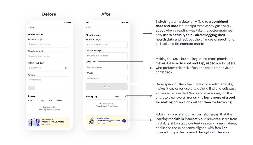
The original records section used a table layout that became difficult to use on smaller mobile devices. Dense rows, truncated text, and horizontal scrolling made it difficult to quickly scan or edit recent entries. To improve long-term usability, the table format was replaced with individual history log cards. This new structure supports better visual scanning, clearer grouping of related information, and easier interaction on smaller screens. It also aligns more naturally with how users log and review health data on mobile.


User flow 02. SMART Habit Setup and Pledge Flow


Several intermediate steps were removed by eliminating confirmation checkboxes that didn’t add real decision value. This made the flow shorter and reduced repetitive micro-decisions that could slow users down. The updated sequence keeps the focus on reflection rather than constant validation, which better supports a habit-building mindset. Clear step labels, consistent habit context at the top, and predictable primary actions help users stay clear on where they are and what’s coming next. Overall, the flow now feels calmer, faster, and easier to complete without losing its purpose or meaning.
User flow 03. Home Screen view for the First-time & Subsequent Users
04. Impact
The impact of these changes was evaluated through user testing, design reviews, and user walkthroughs with one of our client’s design team. We closely observed how easily users moved through the flow, where they hesitated, and how many steps it took to complete key actions. This helped us understand whether the experience felt clearer, smoother, and more predictable after the redesign.
-
Habit setup flow: Step level drop-off decreased from 60% to 18%.
-
History Log: Users added, reviewed and edited entries faster, reducing the overall task time.
-
Home screen: First-time users spotted key actions more quickly and felt less overwhelmed, creating a smoother experience after onboarding and when returning to the app.
05. Key Learnings
-
This project taught me how small changes in hierarchy and flow can have a big impact on how people feel when using a mobile app. Especially in healthcare, where users are trying to build meaningful habits, clarity and reassurance often matter more than adding extra information.
-
I learned that making progress visible (visibility of system status) and reducing early decisions helped users move forward with less hesitation. Clear cues about where they are, what comes next, and when they can pause made the experience feel calmer and more supportive.
-
Designing for long-term use meant thinking beyond just the first interaction. Making the app easier to read, reducing repeated steps, and allowing quick edits helped in keeping the experience smooth and user-friendly.